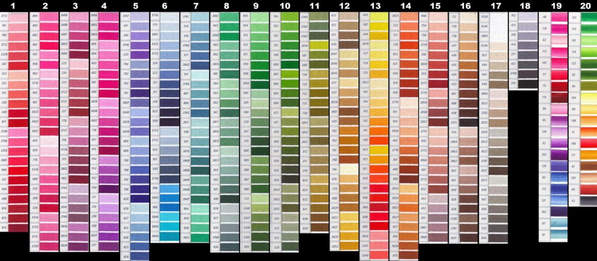
Color is everywhere: fashion, advertising, food packaging, cars, décor, sports team colors, just to name a few. Understanding people’s perceptions of it is complex, confusing, and quite challenging for the marketer. There are many possible variations and reasons why people see color differently that include culture, gender, the ambient lighting, and other factors.
In the West people wear black for mourning, while in the East (China in particular), white is the color of mourning. In many informal surveys, the majority of people name blue as their favorite color. It’s claimed that red and orange make you hungry because they are “warm” colors and thus stimulate the appetite. Ever notice the main colors used by fast food restaurants?.
There is a study on how wearing red jerseys seemingly resulted in a sports team winning more than when they wore blue ones. You can read about it at Der Spiegel and National Geographic. In the sports jersey study, one theory suggests that red intimidates the opposing team because it’s a signal of strength (based on male strutting in the animal kingdom). Another suggests that is stimulates the winning team. But this doesn’t explain why the “donate” button on so many nonprofit websites is red. I suspect that organizations have done some A/B testing and determined that red got better results than the competing color – perhaps because it captures attention.
But, is red really red? Scientists from Arizona State University published a study on the differences in how men and women see the color red in the American Journal of Human Genetics. The study shows that while men tend to see “just red”, women see a much wider range of colors, such as burgundy, tomato, and crimson. There is a gene that lets us see the color red, and women happen to have two copies of it sitting on the x chromosome. Men just have one copy. So I have to wonder how the sports jersey xperiment would fare with female teams.
Faber Birren appears to be the father of Color Psychology. Trained at the Chicago Art Institute, he first tried to become a landscape painter but realized he didn’t have a talent for it. Instead he became an industrial color consultant, keeping diligent records on color trends for items such as paints, furnishings, and plastics. Birren wrote numerous articles and books on subjects such as how color can reduce fatigue, or heal, or even reveal information about personalities. And he had a large influence on the development of factory and other workplace environments.
The most scientific source I found regarding a comprehensive approach to understanding color perception was a formal academic research project by a man named Joe Hallock, who is currently a user experience designer with Microsoft. His project consists of a detailed, and properly controlled survey of 232 people across 22 different countries, and is full of pie charts and graphs that clearly show trends.
It identifies differences in how men and women perceive color (men tend to dislike purple), how our color preferences change as we age, how colors relate to certain concepts (such as bravery), and how color may relate to a person’s online activities (such as shopping, making a donation, or sharing). He was unable to attract enough people to obtain meaningful information about cultural differences – though that had been a primary goal at the beginning. Nevertheless, what he did learn is fascinating, and incredibly useful to the practice of branding and marketing.
It’s important to understand that the perception of color may vary widely based on multiple factors: age, gender, cultural identity, time of day, type of lighting, scale, environment in which it is displayed, structure and function of the individual eyeball/brain connection, and more.
For example, in Hallock’s study, he discovered that purple is one of men’s least favorite colors, but it’s also a color they associate with the concepts of bravery and courage. This is interesting in that it underscores the subjective nature of color perception. Here, it seems as if the generic idea of the color “purple” is not liked by most men, but the association of a Purple Heart medal with bravery and courage puts the color into a different context, and changes their response to it.
To successfully use any information about how people perceive color we must first have a strong understanding of the audience demographic, combined with knowledge of the specific goals of the client. Armed with that information, we might then begin to have an idea of the best color choices for a logo for a non-profit organization that supports war veterans, or a for-profit organization that supports the human resources departments of multi-million dollar companies. We might better know what color to make the “donate” button on a home page, or the general color scheme for a business card.
So, what color is brave? It depends who you’re asking.
Marcy is the founder and creative director with Wire Media, an award winning marketing strategy firm. She holds an MFA in design & technology from Parsons School of Design and a BA in political science from U of Wisconsin-Madison. She taught web design and coding for over 7 years at Parsons, has a 2nd degree black belt in taekwondo, and is editing her first novel.
Tell Us Your Best Color Story
If you have information about color theory studies, or any examples or stories
to share about how color made a difference on a project, we’re interested.
And, when you do, let us know your favorite color.