
Navigating the digital and physical world can be an exhausting challenge for individuals with visual impairments. Whether reading an important email, scanning a prescription bottle, or browsing a news website, the typography used can either be a helpful bridge or a frustrating barrier. Finding the best font for low vision is not just a matter of aesthetic preference; it is a critical component of inclusive design that empowers millions of people to consume content independently.
If you are a web developer, a graphic designer, or someone looking to optimize your own reading environment, understanding the mechanics of accessible typography is essential. In this comprehensive guide, we will explore the science of text legibility, break down the top typefaces, and outline actionable strategies to create truly inclusive reading experiences.
What Makes a Typeface Easy to Read?
Before we name specific fonts, it is crucial to understand the anatomy of typography. Many standard fonts prioritize sleek, modern aesthetics over actual readability, which can be disastrous for users with visual impairments. When determining what makes a typeface easy to read, typographers look at several specific structural elements.
1. Distinct Character Shapes
One of the most common issues in typography is the “imposter letter” problem. Think about the uppercase “I” (India), the lowercase “l” (lima), and the number “1”. In many standard fonts, these three characters look identical. Prioritizing character distinction in inclusive design ensures that readers do not have to rely heavily on context clues to decipher a word. A great font will have a distinct hook on the lowercase “l” and clear serifs on the uppercase “I”.
2. Generous x-Height
The “x-height” refers to the height of lowercase letters (like an ‘x’) relative to uppercase letters. A large x-height for improved letter recognition is a staple of highly legible typefaces. When the lowercase letters are taller, there is more white space inside the loops and bowls of letters like “e,” “a,” and “o.” This prevents the letters from looking like solid black dots when viewed by someone with blurry vision.
3. Open Apertures
An aperture is the opening in letters like “c” or “s”. If a font has a “closed” aperture, the ends of the “c” curl tightly inward, making it easily mistakable for an “o” at smaller sizes. Typefaces with wide, open apertures are inherently more readable.
4. Adequate Letter Spacing
Letters that sit too close to one another tend to visually merge. For instance, an “r” and an “n” squished together will look exactly like an “m” (rn vs m). Reducing crowding effect in digital text by choosing a font with generous natural tracking (letter spacing) is vital for readers with low vision.
The Great Debate: Serif versus Sans Serif for Visual Impairment
For decades, designers have debated the merits of serif versus sans serif for visual impairment. Serifs are the small decorative strokes at the ends of letters (think Times New Roman), while sans serif fonts lack these strokes (think Arial).
Historically, it was believed that serif fonts were best for printed books because the serifs created a “line” that guided the eye. However, modern accessibility research generally leans toward sans serif fonts as the best font for people with low vision, especially on digital screens.
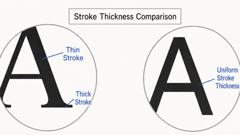
Standard serif fonts often feature varying stroke thicknesses—some parts of the letter are very thick, while others are hairline thin. For someone with low vision, those thin lines simply disappear, leaving fragmented, unrecognizable shapes. Sans serif fonts usually have a uniform stroke weight, ensuring that the entire letter remains visible, making them highly reliable readable fonts.
The Top Recommendations: Best Font for Low Vision
If you are looking to update your website, design a brochure, or adjust your e-reader settings, here are the top typefaces proven to enhance readability for the visually impaired.
1. Atkinson Hyperlegible
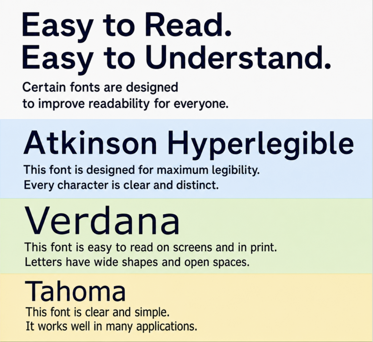
Developed by the Braille Institute, Atkinson Hyperlegible was named after the organization’s founder, J. Robert Atkinson. When evaluating Atkinson Hyperlegible vs standard fonts, the difference is staggering. This typeface was explicitly built around the concept of character distinction. Every single letter and number is designed to look as different from the others as possible, even when blurred. It features distinct slashes through zeros, exaggerated shapes, and a highly uniform stroke weight. For many accessibility experts, this is currently the ultimate best font for low vision.
2. Tiresias
The Tiresias font family was developed by the Royal National Institute of Blind People (RNIB) in the UK. Specifically, the Tiresias Screenfont for electronic displays was created with digital reading in mind. It features open counters, clear punctuation marks, and extended ascenders and descenders to help readers distinguish between similar words. It is frequently used in television subtitling and public transport displays.
3. APHont
Created by the American Printing House for the Blind, APHont was uniquely engineered as the best font for vision impaired readers. It embodies all the critical elements of accessibility: an exceptionally large x-height, heavy consistent stroke weights, wide natural letter spacing, and open apertures.
4. Verdana and Tahoma
If you need to use standard, universally available system fonts, Verdana and Tahoma are excellent choices. Designed by Matthew Carter for Microsoft specifically for on-screen reading, Verdana boasts wide proportions and loose letter spacing. While not custom-built for visual impairments like Atkinson Hyperlegible, they remain exceptionally legible typefaces that are safe for any web project.
Tailoring Typography to Specific Eye Conditions
“Low vision” is a broad umbrella term encompassing a wide variety of ocular diseases. Because different conditions affect the eye in different ways, the ideal typographic approach can sometimes vary.
Macular Degeneration
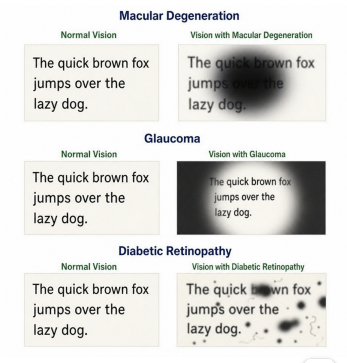
Age-related macular degeneration (AMD) causes a loss of central vision, forcing individuals to rely on their peripheral vision, which has lower resolution. Utilizing accessible typography for macular degeneration means prioritizing bold, heavy sans-serif fonts. Because the reader cannot focus directly on the center of the word, thick, unambiguous letterforms (like Arial Black or a heavy weight of Atkinson Hyperlegible) allow the brain to quickly recognize the shape of the word from the periphery.
Glaucoma
Glaucoma typically results in the loss of peripheral vision, creating a “tunnel vision” effect. When determining the optimal font size for people with glaucoma, bigger is not always better. If the font is massively oversized, only one or two words will fit within the reader’s narrow field of view, causing them to constantly move their eyes or head, which leads to rapid fatigue. A moderate font size (around 14pt to 18pt) combined with a highly legible sans serif font allows for smoother, more comfortable scanning.
Diabetic Retinopathy
Diabetic retinopathy can cause scattered blind spots (floaters) and fluctuating blurriness throughout the visual field. Creating inclusive typography for diabetic retinopathy requires eliminating visual clutter. This means avoiding ultra-thin fonts, condensed fonts, or intricate scripts. High-contrast, sturdy fonts with generous spacing are necessary so that if a blind spot obscures one letter, the surrounding letters are clear enough to provide context.
Beyond the Font: Best Practices for Legibility
Choosing the right typeface is only half the battle. How you format that text is equally vital. To truly support users, designers must adhere to holistic best practices.
Contrast and Color
Even the most perfectly designed font will fail if it is displayed in light gray against a white background. Implementing high contrast fonts for visually impaired users is an absolute necessity. Black text on a white or pale yellow background is ideal. Alternatively, for light sensitivity, white text on a dark charcoal background works beautifully. Avoid pairing contrasting colors with similar visual values, such as red text on a green background.
Formatting and Spacing
When optimizing a layout, adjusting line spacing for better readability is a quick yet highly effective win. Often referred to as “leading,” line spacing should generally be set to at least 1.5 times the font size. This prevents the descenders of the top line (like the bottom of a “y”) from tangling with the ascenders of the bottom line (like the top of an “h”). Ample line spacing makes it drastically easier for the eye to track from the end of one line back to the beginning of the next.
Guidelines and Standards
For digital content, strictly following the WCAG guidelines for text legibility (Web Content Accessibility Guidelines) ensures your site meets legal and ethical accessibility standards. WCAG requires a minimum contrast ratio of 4.5:1 for standard text and 3.0:1 for large text. Furthermore, text should be resizable up to 200% without the user needing to employ assistive technology or scroll horizontally.
Print Considerations
When navigating how to choose accessible print typefaces, remember that physical ink behaves differently than digital pixels. High contrast fonts are still required, but you must also factor in the paper finish. Glossy paper creates glare that can severely disrupt reading for seniors or those with cataracts. Choose a heavy sans serif font printed on matte, non-reflective paper.
Furthermore, prioritizing a clean, left-aligned layout (rather than justified text) helps prevent uneven “rivers of white space” from running down the page. This approach is highly effective in improving reading speed for seniors with low vision, as it provides a predictable, consistent starting point for every single line of text.
Conclusion: Making the Right Choice
Visual impairment shouldn’t mean a barrier to information. Creating an accessible environment begins with intention and an understanding of how typographic elements interact with human sight.
When searching for the best font for low vision, prioritize typefaces with uniform stroke weights, generous x-heights, open apertures, and undeniable character distinction. Embracing specialized typefaces like Atkinson Hyperlegible or trusted classics like Verdana, paired with high-contrast colors and thoughtful spacing, can profoundly change how a user interacts with your content. By prioritizing accessible design, we not only comply with essential guidelines but also build a more inclusive, empathetic, and readable world for everyone.