Color contrast grid
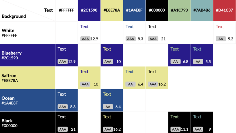
The Contrast Grid, created by Directed Edges (formerly Eight Shapes) is a handy way to check which of your brand colors, when combined, have enough minimum contrast to be legible for accessibility purposes.
We setup Wire Media’s brand colors in the Contrast Grid to show how you how it works. There are options you can toggle on and off, each creating a unique URL so it’s easy to see the following options:
- Meets WCAG 2.0 AAA
- Meets WCAG 2.0 AA or better
- Passes WCAG 2.0 AA for large text only (18 pt or larger)
- Does not pass
You can replace any of these with your own brand colors and create your own unique URLs.
Learn more about why accessibility matters and get some stories about real situations where an accessible is really necessary. Or access all of our articles about accessibility.