If you run a nonprofit, your website is one of your most important tools. It helps you spread your message, connect with supporters, and serve your community. But if your website isn’t fully accessible, you could be shutting out people who need your help the most.
That’s why it’s important to consider whether or not your website needs to be AAA accessibility compliant — the highest level of accessibility according to the Web Content Accessibility Guidelines (WCAG). AAA compliance ensures your website is easy to use for people with disabilities, including those who are blind, deaf, or have cognitive challenges.
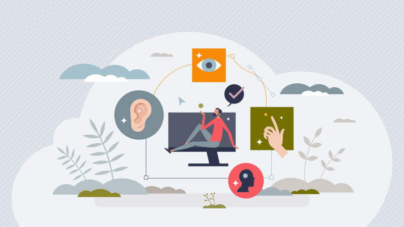
You don’t need to be a tech expert to make your website accessible. We want to share three key areas for you to think about: design, reading level, and navigation. By considering these aspects, you’ll make your site more welcoming and usable for everyone!
Get our guide on how to start making your website available to everyone.
Get the Guide1. Designing for Accessibility
Good design isn’t just about looking nice — it’s about making sure everyone can use your website comfortably. Here are some ways to improve accessibility through design:
Use High Color Contrast
People with low vision or color blindness need strong contrast to read text easily. AAA guidelines recommend a contrast ratio of 7:1 for regular text and 4.5:1 for large text.
❌ Bad Example: Light gray text on a white background (hard to see).
✅ Good Example: Black text on a white or yellow background (easy to read).
There are free tools online, like the WebAIM Contrast Checker, that help you test your website’s colors.
Avoid Relying on Color Alone
Some people can’t see color differences, so don’t use color as the only way to show information.
❌ Bad Example: “Click the green button to donate.”
✅ Good Example: “Click the green Donate button (labeled in bold).”
Adding text labels, icons, or patterns helps make information clear to everyone.
Provide Alternative Text (Alt Text) for Images
People using screen readers rely on alt text to understand images. Every image on your site should have a short description that explains its meaning.
❌ Bad Alt Text: “Image of a person.”
✅ Good Alt Text: “A volunteer handing a meal to a homeless person at a shelter.”
If an image is decorative and doesn’t add meaning, you can mark it as “decorative” by leaving the alt text blank, so screen readers skip it.
Use Captions and Transcripts for Videos
Not everyone can hear audio, so always include captions for videos. Also, provide transcripts for podcasts or any audio or video content.
Free tools like YouTube’s automatic captions can help, but it’s best to double-check them for accuracy.
Make Clickable Elements Large and Easy to Click
Buttons, links, and other clickable items should be big enough for people with limited mobility to use easily. AAA compliance recommends a 44×44 pixel minimum size.
2. Writing at an Accessible Reading Level
Nonprofit websites often share important information, but if the language is too complex, people might struggle to understand it. AAA guidelines recommend writing at a lower secondary education level (around 8th grade) whenever possible.
Here’s how to keep your writing accessible:
Use Simple, Clear Language
Use common words and short sentences. Avoid jargon, technical terms, or complicated phrasing.
❌ Too Complex: “We facilitate the procurement of essential nutritional sustenance for individuals experiencing food insecurity.”
✅ Clear & Simple: “We provide food for people who don’t have enough to eat.”
A great tool for checking reading levels is the Hemingway Editor (free online). Aim for a Grade 8 reading level or lower.
Break Up Large Blocks of Text
Reading long paragraphs is hard for many people, especially those with dyslexia or cognitive disabilities. Instead:
- Keep paragraphs short (2-3 sentences).
- Use bullet points and lists when possible.
- Add headings and subheadings to organize content.
Provide Definitions for Unfamiliar Words
If you must use a technical term, provide a simple definition.
For example:
📌 Advocacy (helping people speak up about issues that matter to them).
Offer Multiple Language Options
Many people don’t speak English as their first language. If possible, provide translations or a simple language version of key pages.
Google Translate can help, but professional translations are more accurate.
3. Improving Navigation for All Users
Navigation is how people move around your website. If it’s confusing or difficult to use, visitors might leave before they find what they need. Here’s how to make navigation accessible:
Ensure Keyboard Navigation Works
Some people can’t use a mouse and rely on a keyboard instead. Test your site by using only the Tab key to move around. Can you reach all links, buttons, and forms?
If not, talk to your web developer about improving keyboard accessibility.
Use Descriptive Link Text
Links should clearly describe what they lead to.
❌ Bad Link: “Click here”
✅ Good Link: “Read our Volunteer Guide”
This helps screen reader users understand where a link goes without extra guesswork.
Create a Clear, Consistent Menu
Your website’s menu should be simple and easy to follow. Keep the number of menu items manageable (usually 5-7 main options).
For example:
✅ Good Menu: Home | About Us | Programs | Get Involved | Contact
If your nonprofit has a lot of content, use breadcrumbs (small links at the top of pages showing the path: Home > Programs > Food Assistance).
Use ARIA Landmarks for Screen Readers
ARIA (Accessible Rich Internet Applications) helps screen readers navigate better. Your web developer can add ARIA landmarks to label sections like header, navigation, main content, and footer.
Final Thoughts
The examples here are just part of creating a AAA level accessible website. But you have to start somewhere. Making your nonprofit’s website AAA accessible isn’t just about following rules — it’s about everyone being able to access your information, services, and mission.
By focusing on design, readability, and navigation, you’ll create a site that welcomes people with disabilities, older adults, and anyone who struggles with traditional websites.
If you’re unsure where to start, you can use tools like:
- WAVE Accessibility Checker (for testing accessibility)
- Hemingway Editor (for checking reading level)
- WebAIM Contrast Checker (for color contrast)
Remember, accessibility isn’t a one-time fix—it’s an ongoing process. Even small changes can make a big difference! By making your website truly accessible, you’re ensuring everyone can be part of your mission. And that’s what being a nonprofit is all about.
Further reading and resources: