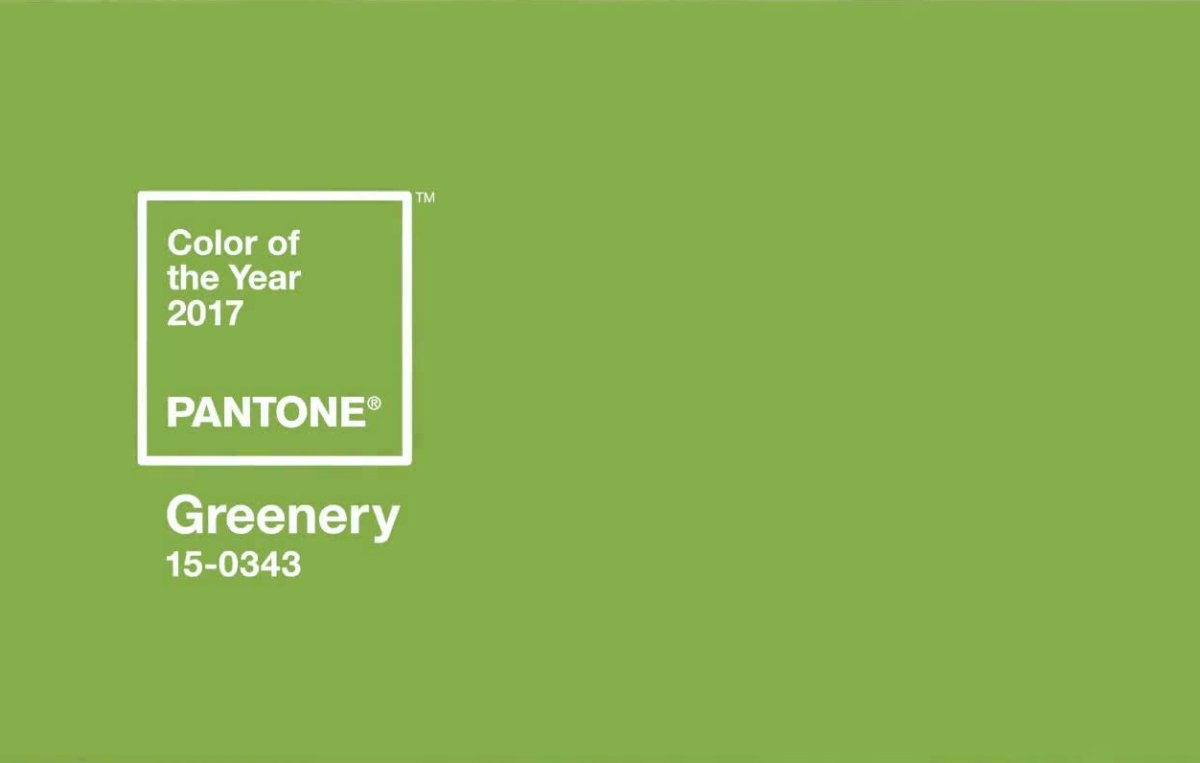
The color itself is quite lovely. As is the sentiment behind its selection.
Executive Director of the Pantone Color Institute, Leatrice Eiseman, said:
“Greenery bursts forth in 2017 to provide us with the reassurance we yearn for amid a tumultuous social and political environment. Satisfying our growing desire to rejuvenate and revitalize, Greenery symbolizes the reconnection we seek with nature, one another, and a larger purpose.”
Of course the meaning of color is subjective. But Pantone has ignored the downside of Greenery. While the color does represent new shoots in springtime and fresh granny smith apples, it also is the color of fake grass, sour green Jolly Ranchers, and plastic soda bottles. These associations mean it also represents an attitude against the environment, and against health and well-being. It thus symbolizes the destruction of nature, the ills of consumerism, and leaves a sour taste in one’s mouth.
Given the increasing number of people with their faces constantly buried in a screen, there doesn’t seem to be any larger social motivation to reconnect with nature, unfortunately (outside of save-the-environment circles). Perhaps Pantone hopes people want to reconnect with nature, and that seeing this shade everywhere win 2017 will somehow prompt that desire?
And, here in the US, we are basically the opposite of wanting to reconnect with each other. The nation is firmly split into two completely opposed camps as a result of our recent presidential election. People are angry, frightened, and sad. And this is not just happening here. There’s Brexit, and Marine Le Pen in France, and Kellie Leitch in Canada. All representing a conservative backlash against many of the culture-altering changes that have recently transformed the US and other countries — legalizing gay marriage, letting in immigrants and refugees, automation of blue collar jobs to name few.
As we move forward in a world where the divide between the super-rich and the rest of us keeps getting wider, where democracy is under attack, and where humans are doing the bare minimum to mitigate the effects of climate change, I suppose it’s nice to have a color that attempts to represent hope, growth, and a new beginning. But we’re not there yet. Before we can have a new beginning, we must solve these challenging problems.
Simply seeking to reconnect is too soft for what 2017 holds. A metallic silver would have been a strong choice for Pantone color of the year in 2017. Silver is the color of many technology products, finely crafted swords, and mirrors.
Silver represents reflection, purity, and strength. Silver would represent the courage to fight for what’s right, to take action, and to win. And that, more than trying to reconnect with those working really hard to take away basic rights, is what we need in 2017.