Nonprofit websites that get results follow certain best practices that require a decent amount of time on planning, and understanding your audience. It’s worth investing the time in these activities because in the long run, your website will become a very valuable tool in helping you connect with people truly interested in your cause.
1. Clear Strategic Objectives
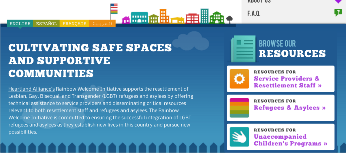
Prioritize the goals for the website, and make decisions on content, features, and design based on those priorities. This will help you stay on track to creating a website with intrinsic value. Clear strategy lets you decide how much time to invest in each aspect of the site, what features are most important, how they should work, and how you will handle changes down the road. This saves time and, assuming the strategy is on-track, improves results. For example, on the Rainbow Welcome website the clear priority was ease of use of the resource database, so our focus was mostly on that interface and its design.
2. Clear Navigation, Designed for the Primary Audience
A website’s main navigation should clearly indicate to the primary audience what they can do there, and, ideally should let them click on something that solves whatever problem they came to the site to solve. For example, on the Fulfillment Fund website, we knew that a large chunk of their audience was motivated by the concept of helping a student succeed. Thus the single main “action” button reads “You can change a student’s life” and only when they mouse over do they see their options to make this happen.
3. Responsive Design
Responsive design offers the advantage of the website displaying well on devices with various screen sizes. By displaying well, chances of engagement or participation increase. For example, when you view the Fulfillment Fund website on your phone, the interactive images on the home page are hidden. This is to let phone users get right to the content without having to scroll. Cross-browser performance matters too. The general idea is to build the site in a way that it works great however your audience members decide to access it.
4. Content Strategy
A well-crafted content strategy means that people can find information on the website where they might expect, and everything is clearly labeled so there’s no surprises. It also means that it’s obvious what you are sharing if you click “like” or “tweet” or other share links. Knowing what to expect improves usability, so simple design features like making it clear that if you click a link it will open a PDF file instead of a web page, are very important, and usually easy to implement.
5. Critical Information is Visible Without Scrolling
This should be true on any device. That’s why we eliminated the fun interactive element from Fulfillment’s phone version for example. If you make people scroll, you just introduce a barrier on the path of their action. Better results are achieved with less barriers. They key to doing this well is to prioritize, thinking about the smallest screen size first, and working your way up.
6. Search Engine Friendly Writing Habits
There is one key thing to remember to improve website ranking in search: “quality content is king.” Search engines attempt to deliver results that are relevant to the search being performed. Search engine optimization is mostly about content. Put keywords into headlines and subheads, and sprinkle them gently within the content. Make sure to put text in the “alt” tags on all images. Write simply and make sure what you write makes sense to your audience. Name and title pages, images, and documents logically. In general, the quality of your content can make or break your search engine results over time.
7. Branded Design
Branding is more than look and feel, though that’s still a big part of it. A well-branded website sets itself apart from the competition through a unique look and feel, the tone of its copy, the style of its images, and perhaps most importantly, how its staff members interact with its audience online and off. Fulfillment Fund uses easy-going, friendly language and design with a focus on the faces of the students it serves on the website and in its Facebook and Twitter interactions. This appeals to its youth-friendly audience and creates a safe, inviting atmosphere that people respond to.
Conclusion
While those are not by any means the only things you need to consider in creating a truly effective, winning website with ROI, they are key. By focusing on content, usability, and brand you can achieve excellent and measurable results that bring you closer to your organizational goals.